Luluna Health —
Luluna Health —
Luluna Health —
Brand Identity, Packaging, and Long-Term Brand Development for a Sustainable Beverage Company
Brand Identity, Packaging, and Long-Term Brand Development for a Sustainable Beverage Company
Brand Identity, Packaging, and Long-Term Brand Development for a Sustainable Beverage Company
Brief
Brief
Brief
When Luluna Kombucha first launched, it was more than a beverage. It was an early expression of conscious consumption in New England.
Sold in refillable jugs at local markets and fill stations, made with spring water and locally sourced botanicals, Luluna established itself as a values-driven alternative before sustainability became a category standard. The product was rooted in ritual, community, and respect for natural systems.
Studio Quiche partnered with Luluna more than eight years ago to build a brand that could honor this ethos while leaving room for growth. From the beginning, the challenge was not visibility alone. The brand needed to reflect a living process and remain adaptable as the company evolved from local markets into broader retail environments.
Packaging Design
Long-Term Brand Development
Visual Identity
Sustainable Strategy


Strategy
Strategy
Strategy
The brand strategy was shaped by the product itself.
Fermentation is a living process, driven by invisible forces that transform over time. Rather than borrowing visual language from wellness trends or beverage conventions, we built the identity around this idea of unseen activity and continual change.
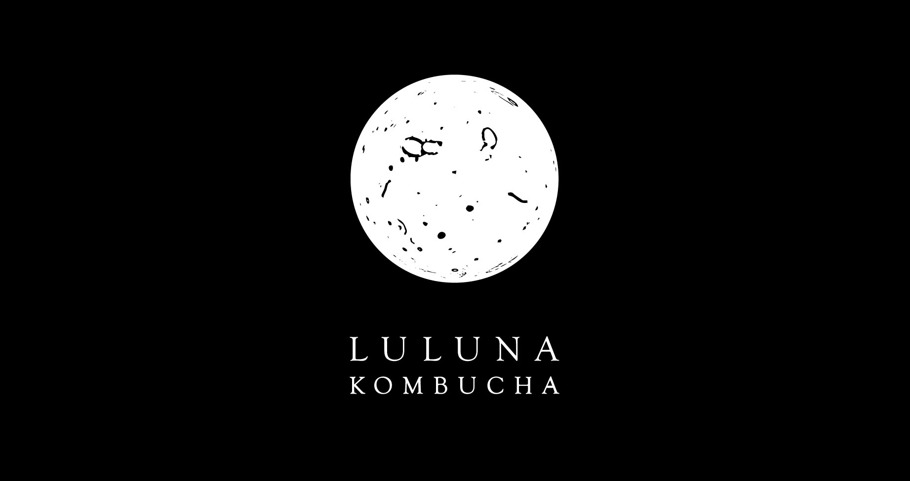
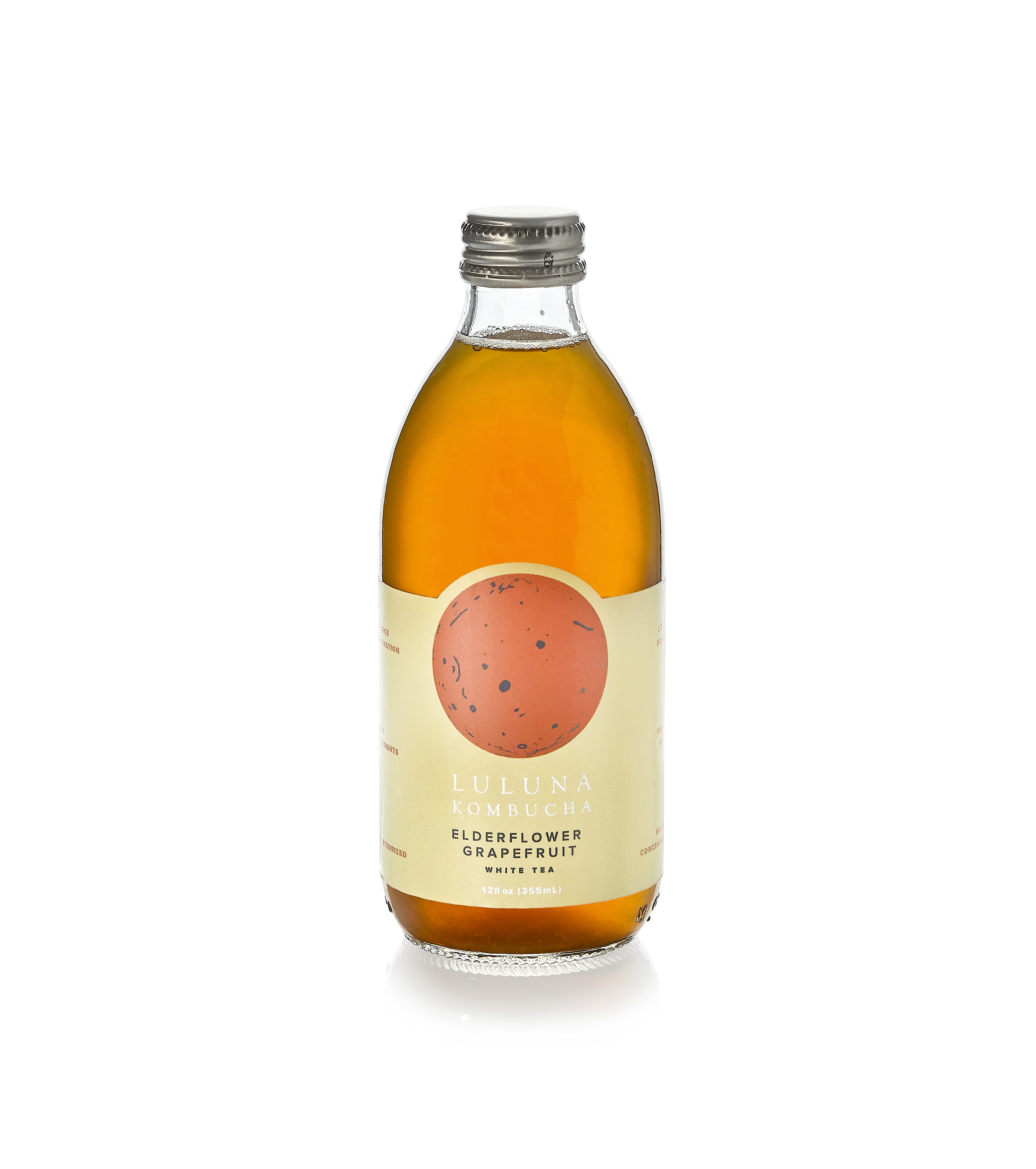
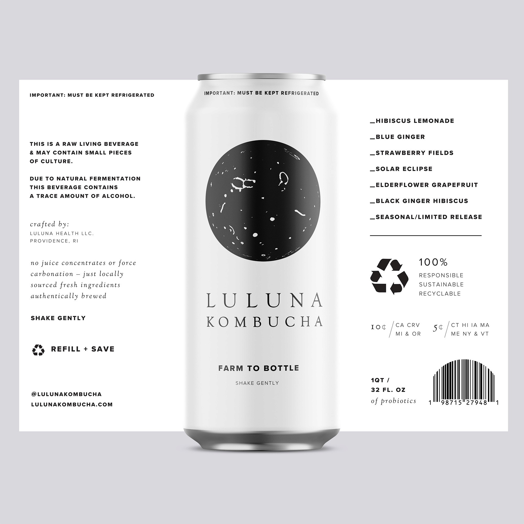
At the core of the system was a media-agnostic symbol inspired by microscope photography of kombucha scobies. This textured form, referred to as the probiotic moon, became the visual heartbeat of the brand. It represented transformation, balance, and the science behind the craft.
Key strategic principles guided the work:
Process over polish. The identity emphasized texture, variation, and organic imperfection.
System over snapshot. The brand was designed to evolve without losing coherence.
Values as structure. Sustainability and intention informed every decision, from visual language to packaging considerations.
As Luluna transitioned from refill stations to retail shelves, Studio Quiche remained a creative partner. The brand evolved to meet new requirements while preserving the integrity and spirit established at launch.
The brand strategy was shaped by the product itself.
Fermentation is a living process, driven by invisible forces that transform over time. Rather than borrowing visual language from wellness trends or beverage conventions, we built the identity around this idea of unseen activity and continual change.
At the core of the system was a media-agnostic symbol inspired by microscope photography of kombucha scobies. This textured form, referred to as the probiotic moon, became the visual heartbeat of the brand. It represented transformation, balance, and the science behind the craft.
Key strategic principles guided the work:
Process over polish. The identity emphasized texture, variation, and organic imperfection.
System over snapshot. The brand was designed to evolve without losing coherence.
Values as structure. Sustainability and intention informed every decision, from visual language to packaging considerations.
As Luluna transitioned from refill stations to retail shelves, Studio Quiche remained a creative partner. The brand evolved to meet new requirements while preserving the integrity and spirit established at launch.
Kristin Silva
Justine Closterman
Marina Cariello
Kristin Silva
Justine Closterman
Marina Cariello


Results
Results
Results
Today, Luluna Kombucha operates with a brand system built to grow alongside the company.
The identity has supported expansion into retail while maintaining a strong sense of place, purpose, and authenticity. Packaging, visual language, and ongoing brand support continue to reflect the same values that define the product itself.
Rather than outgrowing its origins, the brand has matured with intention. It remains alive, adaptable, and rooted in the natural processes that inspired it from the start.
NEXT PROJECT
NEXT PROJECT
Green Mountain —
Green Mountain —
Green Mountain —
Branding for a sustainable firelog company
Branding for a sustainable firelog company
Branding for a sustainable firelog company
LETS TALK!
Newsletter Signup:
